Our 5 Favorite Easy-to-Use Squarespace CSS Codes & Tricks to Uplevel Your Website
As Squarespace designers, we’re always looking at ways to take a Squarespace site and make it NOT look like a Squarespace site. We love to add an extra WOW factor to our designs where we can. Although there are LOTS of ways to add some extra oomph to your Squarespace site without code (check out our 10 Ways To Make Your Squarespace Site More Dynamic), we have our 5 current favorite (and easy-to-use) Squarespace CSS codes & tricks to help take our designs to the next level.
Let’s get into the Squarespace mini-tutorials…
1. Add Custom Highlight Behind Text
Adding a highlight or color behind text (as seen above in our Amplify template) is a great way to highlight important keywords and just to add a fun visual change to your site.
The Squarespace CSS code below changes any Heading 1 font that is BOLDED to have the highlight.
So once you paste in the CSS code, type something using the Heading 1 font, bold the words you want to highlight, and you’ll see it!
Just make sure to change out the color code for your brand’s colors for this one!
/* Text highlight underline. Only works for bolded h1 text */
h1 strong{
  background: linear-gradient(to bottom, #FFF 60%, #FFD84A 40%) !important;
  font-weight: normal !important;
 }
2. Add Floating Social Links To Your Site
This is a fun way to add a dynamic look to your website by having your social links float on the side of your site.
For this to work, you’ll want to add a Social Links block to your footer first!
After that, add the Squarespace CSS code below.
/* Floating Social Links */
@media only screen and (min-width:640px){
footer{
  .sqs-svg-icon--wrapper{
    display: block !important;
    margin: 20px 10px !important;
  }

  .socialaccountlinks-v2-block{
    position: fixed !important;
    top: 20% !important;
    /* Adjust this percentage to move the icons up or down */
    left: 3% !important;
    z-index: 99 !important;
  }
}
}
3. Move Summary Block Carousel Arrows To The Sides
In Squarespace, when you use a Summary Block Carousel, the arrows to be able to move between items usually appear in the top-right corner of the block.
However, we prefer to have the arrows go on either side of the Summary Block Carousel instead. Take a look at the image below to see a before and after.
If you use the Squarespace CSS code below, this will affect all of your Summary Block Carousels on your site!
/* Change Carousel Arrows */
@media only screen and (min-width:640px){
.sqs-block-summary-v2 .summary-block-setting-design-carousel .summary-carousel-pager {
  float: none;
  width: 100%;
  position: absolute;
  bottom: 50%;
  left: 50%;
  -webkit-transform:
   translate(-50%,-50%);
  -ms-transform: translate(-50%,-50%);     transform: translate(-50%,-50%);
  -webkit-box-pack: justify;
  -ms-flex-pack: justify;           justify-content: space-between;   z-index: 9; }
}
@media only screen and (max-width:640px){
.sqs-block-summary-v2 .summary-block-setting-design-carousel .summary-carousel-pager {
  float: none;
  width: 100%;
  position: absolute;
  bottom: 50%;
  left: 50%;
  -webkit-transform:
   translate(-50%,-50%);
  -ms-transform: translate(-50%,-50%);     transform: translate(-50%,-50%);
  -webkit-box-pack: justify;
  -ms-flex-pack: justify;           justify-content: space-between;   z-index: 9; }
}
4. Auto-Rotate Galleries On Squarespace
On our Willow Template, we have a very dynamic-looking gallery that auto-rotates to add some visual interest to the top of the site.
This is NOT CSS code. This is JQuery! (but you can copy & paste the code similarly to CSS, just in a different place)
Instead, you’ll go to Settings > Advanced > Code Injection, and insert the code below into the header section.
<script   src="https://code.jquery.com/jquery-3.5.1.js"></script>
<script>
$(function(){
  window.setInterval(function(){
    {$("html:not(.sqs-modal-lightbox-open) body:not(.sqs-edit-mode-active) .gallery-reel-control:nth-of-type(2) .gallery-reel-control-btn")
    [0].click()}
  }, 2000);
});
</script>
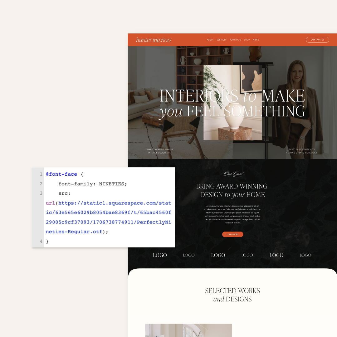
5. Use Two Different Fonts On One Line
This style of font mixing is trending right now! You mix two fonts that look pretty distinctly different together in one text block. This setup is very similar to number one on this list with the highlight!
We use the CSS so that anything using Heading 1 that is BOLDED would change fonts.
Using the Squarespace CSS code below as a guide, just make sure to change out the font style for your preferred font style.
/* Text change detail */
h1 strong {
  font-family: aktiv-grotesk-extended !important;
  font-size: 3.1rem;
}
If you try any of these Squarespace CSS codes, let us know!
Final Conclusion:
YES, there’s definitely some leg work involved to upgrade from Squarespace 7.0 to Squarespace 7.1, but depending on your brand and website goals, it may be worth it! Don’t hesitate to reach out to our team via email to help clarify the process and get our advice on the best path forward for you.


