10 Squarespace Tips To Make Your Website More Dynamic
After spending years running our business creating custom Squarespace websites & templates for our clients and creating Squarespace Website Templates in our shop, we have learned a few tips and tricks for making Squarespace designs stand out online.
One of our goals in each website design is to make it visually dynamic. Dynamic design means that it’s visually appealing, interactive, and effective at the same time.
While you may want a custom, dynamic website design on Squarespace, you might not have the budget for that. We are huge proponents of DIYing your website - especially in the first years - so that you can be a baller on a budget and make smart financial decisions in the beginning stages of your business.
When you DIY your website using Squarespace, you can…
Save money as you’re getting started by doing the work yourself rather than paying for a designer.
Get setup quickly and easily because Squarespace is a super user-friendly platform.
Make changes to your website with confidence because you know the ins and outs of the platform and exactly how the design was set up.
Create a custom look on the web using a Squarespace Website Template or using tons of tricks available online to customize your Squarespace site.
If you have a Squarespace Website and you’re ready to update your site, make some changes, or do a few things to rebrand without a major overhaul, we’ve got a few tips that help us make our client sites pop!
Here are 10 Ways To Customize Your Squarespace Site To Make It Look More Like A Designer Site
1. Create A Photo Collage or Graphic Background.
We love creating custom graphic backgrounds rather than just having a color or single photo background to add a little wow factor to a website. You can easily create this look by using Canva, a free online design program. Toss in photos, colored graphics, and even text to create a really robust and dynamic look.
2. Turn A Static Photo Into An Animated Slideshow.
Using Canva, or this free gif generator, you can turn any spot where you had planned on placing a single image into a gif. For example, we created this animated slideshow featured below that quickly cycles through photos of our team.
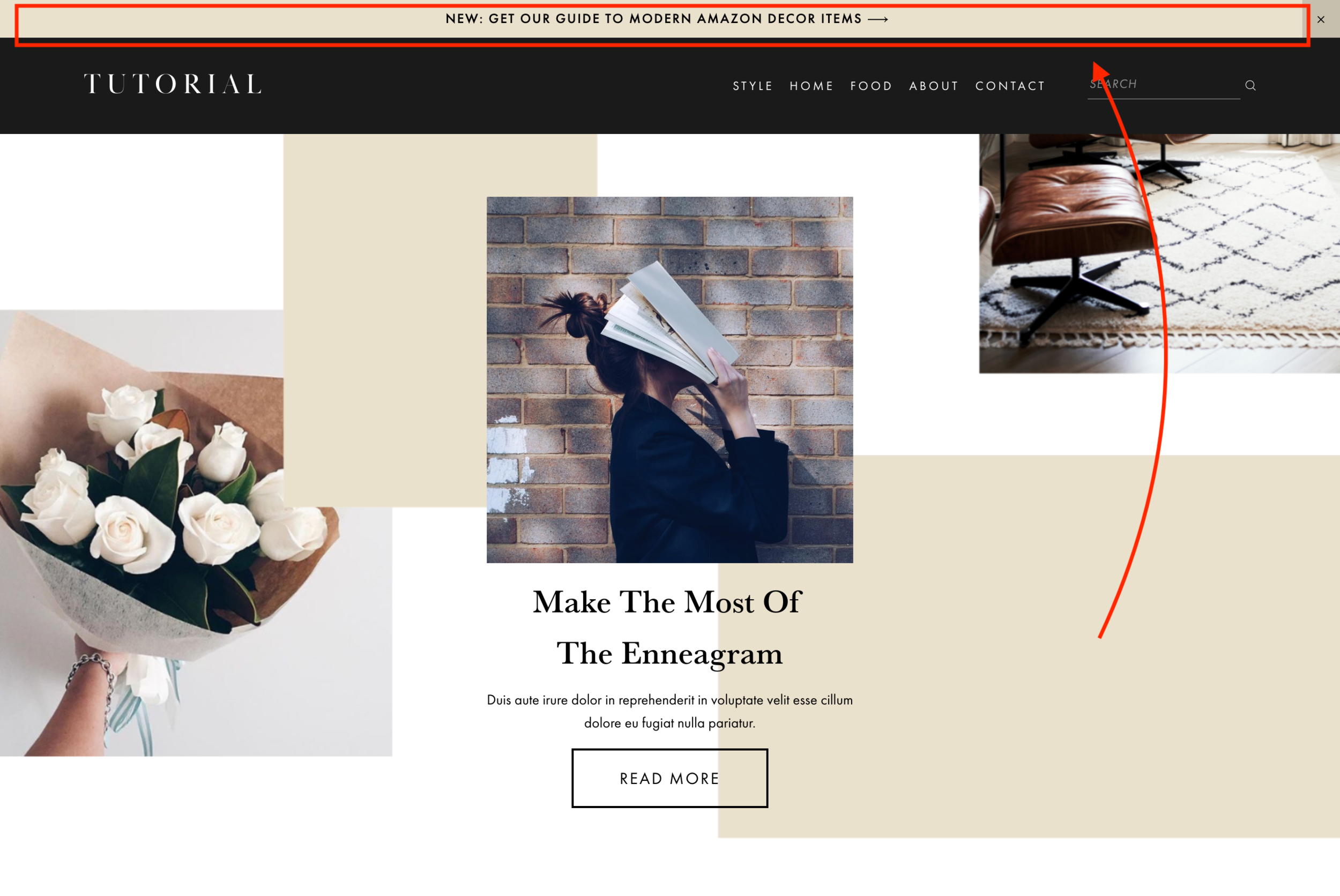
3. Add An Announcement Bar.
While an announcement bar might not be the sexiest thing on this list, a styled announcement bar at the top of your website can quickly and easily direct people to more content. Plus, if you design your announcement bar on Squarespace, you can design it with a pop of color or a font with extra personality.
4. Turn On Background Animations
Squarespace 7.1 has several options to make your background elements move when you scroll down the site, which adds dynamic movement to any website. We’d just recommend — don’t overdo it! Try to find the right amount of dynamic movement for your ideal audience. The example below is the “Pan” effect on our Influence Template for Squarespace 7.1.
5. Add Graphic Elements To Images.
Rather than just uploading a simple photo on your website, go the extra mile by adding some layered custom graphic elements to your images. You could do this with a professional design program or with Canva, our favorite free online graphics tool.
For example, we added a beige rectangle and a thin, vertical black line to the images below for a how it works section.
6. Use A Video Background.
Squarespace lets you use videos from YouTube and Vimeo as a background on a page. This is a really fun and simple way to add movement to your site, especially if you’re using it to promote more video content like your YouTube Channel or maybe even a course you are promoting.
To do this in Squarespace, click the Settings or Gear Icon for the section you want to the video background to. Head to the Background settings, and then select Video. From there, you can paste in the URL of the video you’d like to display.
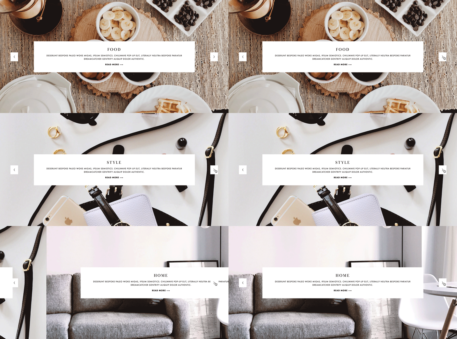
7. Use A Full-Width Gallery.
Full-width sliders on a website page can work to not only dynamically display more content, it can also break up the design on a page that has a lot of white background. To create this slider in Squarespace, simply add a Gallery Page to an Index page. Add your photos to the gallery, and then add headlines and subheadings to each individual photo to put text on top of the photo.
8. Use A Full-Page Pop-Up.
If you have something you really don’t want your website viewers to miss, a full-page pop-up is a great way to demand their attention. Squarespace lets you do this in just a few easy steps by going to Marketing > Promotional Pop-Up. They have a lot of different templates you can choose from. You can upload your own images, craft your copywriting, choose your call to action, decide when it appears and make it live all in one screen.
9. Use Squarespace’s Integrated Animations For Image Blocks.
Squarespace released a feature called Animations in early 2019. Now, when you go to an image block, you can see a tab at the top that says “Animations.” With just a few clicks, you can animate your images to create some movement on your website.
PRO TIP: Don’t overdo this effect! There’s a fine line between strategically dynamic and design that makes your website viewer seasick from all the movement. We’d recommend only using this in select places on each page.
10. Turn On Your Pinterest Save Button.
The Pinterest Save button on a website allows someone to save an image from your website directly to their Pinterest profile. The benefit of doing this is that then your images are available to search for on Pinterest, and then people can find your website through Pinterest’s search engine. That can mean more bookings, purchases or website views for you and your brand.
Squarespace automatically lets you enable this feature just by toggling this setting on or off! Find out exactly how to turn on your Pinterest save button here.
The Wrap Up
Making your Squarespace site feel custom and well-designed doesn’t have to feel overwhelming! We’re here to help with our Squarespace Website Templates that teach you step-by-step how to build the design, and with tons of free tutorials on our blog. Here’s a few posts that can help you get started!
Shop New Squarespace Templates
Save The Graphic Below To Pinterest For Safekeeping











Opulence is an editorial and feminine Squarespace Fluid Engine Template created specifically for photographers to share their services, portfolios, shop, and blog posts. This easy-to-customize template is perfect for photographers and videographers who want a clean aesthetic.
View The Demo