Video Website Critique: How To Change Your Homepage To Make More Sales
We are launching a new video series called “Small Business Website Critiques” where our CEO & Creative Director, Promise Tangeman, will do a live video giving feedback and suggestions to improve for a small business owner who has submitted their website for critique.
Click the video below to watch her live action feedback, and keep reading below to see our biggest takeaways you can apply based on what we see from our very first first website critique with We Are Andrex, a hand-crafted jewelry shop based in San Diego run by twin sisters.
1. Know Your Target Market & Make Design Decisions To Attract Them
From the moment we land on the website, they know who their customer is. The images, colors, and general vibes really attract feminine, beauty, laid back, stylish girl. The fonts, colors, graphics and images are all showing off that feeling and would be attractive to that target market.
How To Apply This To Your Website:
Think about your target market and what colors, fonts, graphics, and images would appeal to them! Take a quick inventory of your website and make sure it’s not just attractive to you, the business owner. Sometimes this means making decisions about your brand that might not resonate with you personally, but will definitely resonate with your ideal client.
An example of this might be that you really LOVE horses and wanted to have horses in your branding. However, maybe your ideal client is a city girl whose hobbies include travel and being indoors. Horses are NOT going to attract or resonate with your client no matter how much you love them.

Define Your Dream Client Mini Workshop
Need help figuring out your ideal client and really getting to know him or her?
2. Make Sure Your Logo Is Large And Easy-To-Read
The logo on the We Are Andrex is small and a little difficult to read. We’d always recommend making sure your logo is large and prominent (but not too large, there is a balance) at the top of your website. That way people know the business name immediately upon landing on your website.
3. Include Keywords About Your Brand, Industry, Or Business In Your Tagline or Brand Bio
In their branding, the logo includes a very cute tagline that says “Handcrafted By Your Favorite Twins.” We’d love to see some keywords about “jewelry” in there so that if we were to read this tagline at the top of the website, we’d know exactly what the business does right off the bat.
How To Apply This To Your Website:
Both on your website and on your social media profiles, make sure your tagline is clear so that people know exactly what you do or what you sell immediately upon landing on your page or profile. If you need help with this, get our FREE Brand Bio Formula here.
4. Adjust Your Navigation To Reflect Your Moneymakers
Although the navigation in this example includes a shop drop-down option, we’d actually recommend doing a little shift here to make it easier for your customers to go straight to your shop. At the time of this video, the navigation on the site was:
Shop
Our Story
Giving Back
#WeArePink
We’d recommend changing the navigation to the main moneymakers, and then putting the other pages either in a secondary navigation or even a footer navigation. The new primary navigation would be:
Necklaces
Bracelets
Rings & Earrings
Tees
How To Apply This To Your Website:
If you are a shop, make sure your primary navigation reflects your shop categories. If you are a blogger, make your primary navigation your main blog categories. And, if you are a service-based business, make sure your primary navigation includes a page featuring your services, your portfolio and a way to contact you.
5. Make Sure Your Homepage Is Clear And Focuses On Your Moneymakers
At the top of the homepage on this design, when we first land on it, the main image does not make it clear right off the bat that it is a jewelry shop. We’d recommend having clear imagery and copywriting at the top of the page that tells us exactly what the site is about and directs us to the main goal of the website: to shop the jewelry.
6. Take Your Design A Step Further To Make Your Design Feel Custom
Lastly, we are loving the modern, minimal and feminine branding. We really feel that they are on the right track, but could take the website design even further with some changes to make the images larger, the graphics more prominent, and overall make the site more dynamic and custom.
How To Apply This To Your Website:
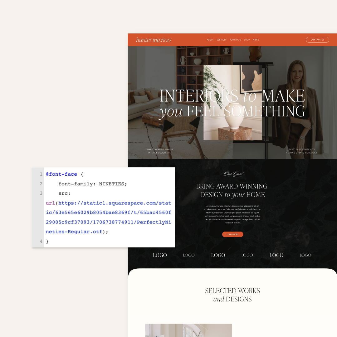
If you are on Squarespace, head over to our shop to see our easy-to-use Squarespace Website Templates that help you stand out on the web with unique and dynamic designs.
Stay Tuned For More Videos
We’ll be posting more video critiques on the blog and on our IGTV! Make sure to follow along to get more robust and actionable website tips and tricks.
Related Articles