
6 Easy Steps To Create A Logo For Your Brand
Having a professional logo is one of the most important parts of a strong and successful business. Your logo visually communicates your brand name and your brand style which, in turn, helps to create brand recognition.
Here at Go Live, we love creating unique and dynamic Wordmark Logos for clients that make a strong first impression on their potential clients and customers.
A Wordmark logo is a text-based design that showcases your brand name by using unique font pairings that are aligned with your brand style. The biggest benefit of using a Wordmark Logo is that, since fonts express emotion, you can choose fonts for your logo based on what you want your potential customer/client TO FEEL when they come across your brand. This helps to create an emotional connection with customers and clients.
(Sidenote: Occasionally we get requests from clients who wants to use an icon as their logo. However, we always advise them to go with a wordmark logo instead. Here's why! You see, while icon-based logos can add a unique and creative flair to your business - often times the intention behind the logo doesn’t translate to clients or customers, which makes it difficult for them to connect with or remember your brand.)
Ready to get started on your wordmark logo? Check out our step-by-step video below to learn how you can design a wordmark logo for your brand using a FREE online program called Canva. That’s right, friends. No Photosohop required!
Six Easy Steps to Create a Logo For Your Brand
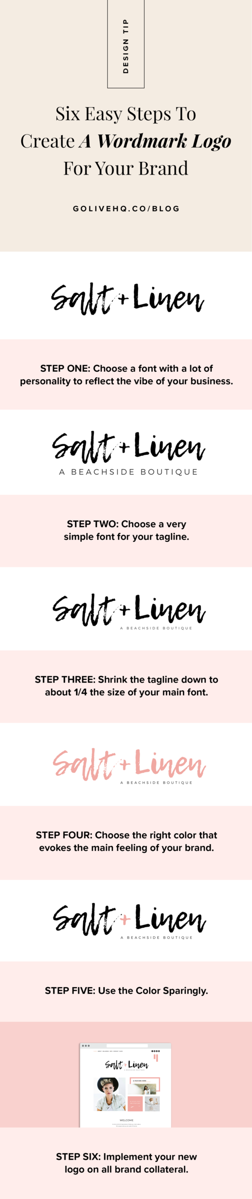
Step One: Choose a font with a lot of personality to reflect the vibe of your business.

Feel free to go big with this one and, again, select a font that creates the FEELING you want clients or customers to have when they visit your brand!
Not sure which fonts reflect the vibe that you want your logo to create? Click here for our Font Vibes Cheatsheet!
Step Two: Choose a very simple font for your tagline.

This font should *not* compete (in size or style) with your main font. Some of our favorites are Montserrat, Roboto, Open Sans, Baskerville, and Playfair Display.
Step Three: Shrink the tagline down to about 1/4 the size of your main font.

This adds contrast, appropriate readability, and proper hierarchy to the design. And again, we don’t want to compete with the main font.
Step Four: Choose the right color that evokes the main feeling of your brand.

Think of colors the best represent how you want clients or customers to feel when they interact with your brand. Do you want them to feel calm and relaxed? What colors reprensent those emotions for you? Maybe you want them to feel excited and energized. Think of colors that make you feel excited and energized.
Step Five: Use the Accent Color Sparingly.

You don’t want the color to overhwelm your logo design, so be sure to use it sparingly and intentionally. Less is more!
Step Six: Implement your new logo on all brand collateral.

*DESIGN TIP: Do not use the logo font as a Header font in your branding. Your logo should look special and stand out*
Now that you have a logo, it’s time to build a website for your brand. Use one of our plug-and-play website templates to take the guesswork out of what to put on your website.
SAVE THIS TIP FOR LATER
Pin The Graphic Below To Your Pinterest Board
Related articles


