3 Ways To Add Personality To Your Squarespace Site + Free Graphic Download
You’ve chosen your Squarespace template, and maybe even added all of you content. But something is missing. You are now thinking, how do you make your site feel special and like it only belongs to me? You are in luck, my friend! We’ve pulled together three tips on how to add personality and create a knockout site. One that will capture the attention of your audience and look different than all of the other Squarespace sites out there.
Let’s get right to it:
01. Break Up Your Content
If you break up your content, it will help the viewer’s eyes flow through the site much better. Shorter line lengths makes your content easier to read – which is really important! If you've put all of the work into writing content, you hope that people actually read it. Let's also use some hierarchy to format your longer text. By breaking up content you begin to highlight the information your WANT your viewer to read if they are just skimming the page. This captures the viewers attention and let’s them know what the important parts are before they dive deeper into the info. For some great examples on how we’ve broken up content, check out the following pages:
02. Show Me Your Moves
In moderation, movement can be very captivating. Squarespace allows you to add moving images very easily. Just add in a gallery block (slideshow), a rotating header (index gallery) or even a gif animation (in an image block). Once you create the rotation, these images become dynamic wether it’s in a large header area or a smaller image block. This technique brings the element of surprise and adds dimension to a static site.
ROTATING HEADER / The header image at the top of Create & Cultivate’s homepage rotates, creating a captivating image area highlighting key articles buried deeper in their website.
ROTATING GALLERY / In this example, the middle image rotates automatically highlighting the blog. They’ve used a gallery block in the slideshow design with automatic transitions to achieve this look "gif-like" animation.
GIFS / Dusty Rose is one of our newest template designs, and utilizes gif animation to have moving images within the fullwidth grid.
03. Make It Personal
To really set your template apart, add in custom graphics that work with your brand. Patterns, text overlays, graphic icons, texture, etc… in your brand colors will create a space that feels like your home online. Add these touches with restraint, a few places here and there and your site will start to feel unique. Maybe a custom line separating text, a texture under your homepage tagline, a custom icon for each section or highlight a button. Here are a few sites that use custom graphics to make their sites feel uniquely them:
Example 01 / Andrea used the TRIANGLE as a constant graphic and treatment throughout her site.
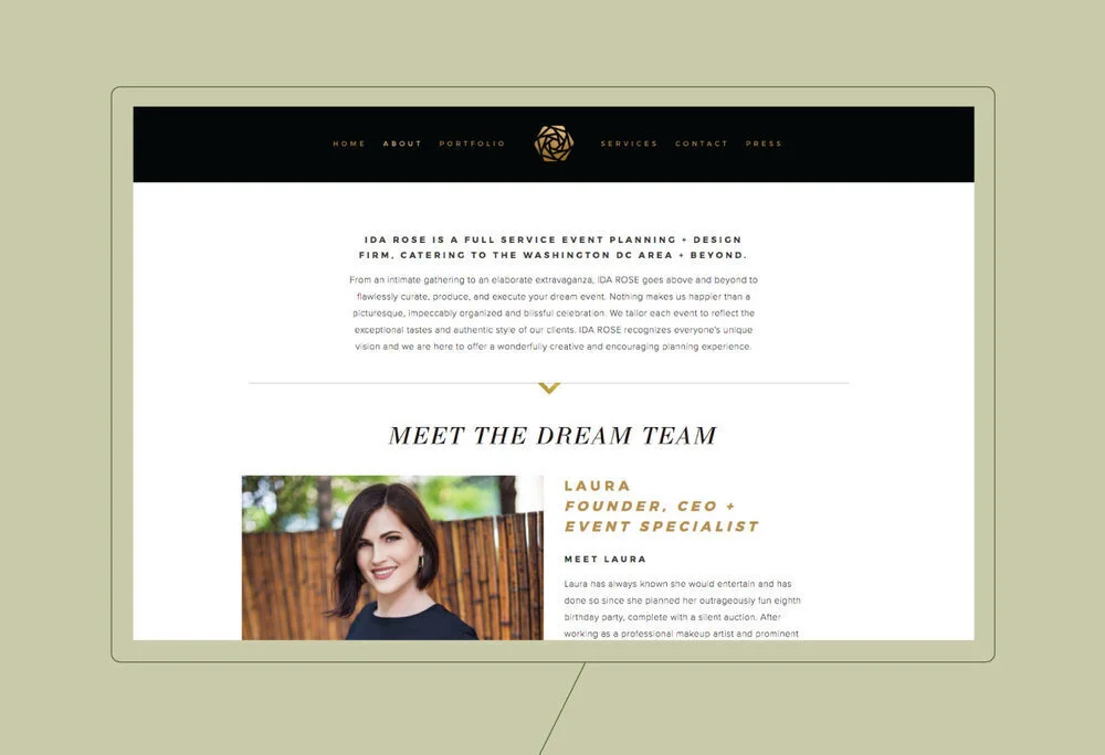
Example 02 / Gold texture was applied in various ways throughout Ida Rose’s site. From the homepage splash texture to the lines separating text HERE.
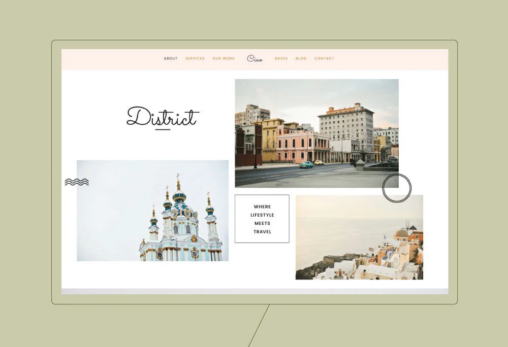
Example 03 / One of our newer templates, this design utilizes special graphics that highlight sections and buttons. You can easily change the wording and color to suit your particular brand needs HERE.
Want to take the guesswork out of what to put on your website? Launch your site with one of our plug-and-play Squarespace templates.


